
## BrewDog’s Bold Branding Revival: A Colorful Design Refresh
BrewDog is shaking off the dust and reclaiming its **edge**. Launched in **2007**, the Scottish brewing company set the UK craft beer scene ablaze with its dynamic branding and immediate market share dominance. However, a *sensible rebrand in 2020* left many feeling that the brand had lost its **punk spirit**. Critics even went as far as labeling it “neutered” ([Creative Bloq](https://www.creativebloq.com/news/brewdog-loses-its-punk-spirit-in-sensible-rebrand)). Fast forward five years, and BrewDog is experiencing a vibrant *rebirth*, suggesting more a *midlife crisis* than a *permanent identity shift*.
### Rediscovering the Rebellious Spirit
With a fresh wave of packaging designs, BrewDog seems to be saying a resounding goodbye to the muted tones of past choices. Are they finally **finding their way** back to the unapologetic roots they championed? The new design strategy reflects a bold departure from the plain, all-caps typography that felt more corporate than *craft*, aiming instead for an aesthetic that screams individuality and flair.
### A New Identity for Each Brew
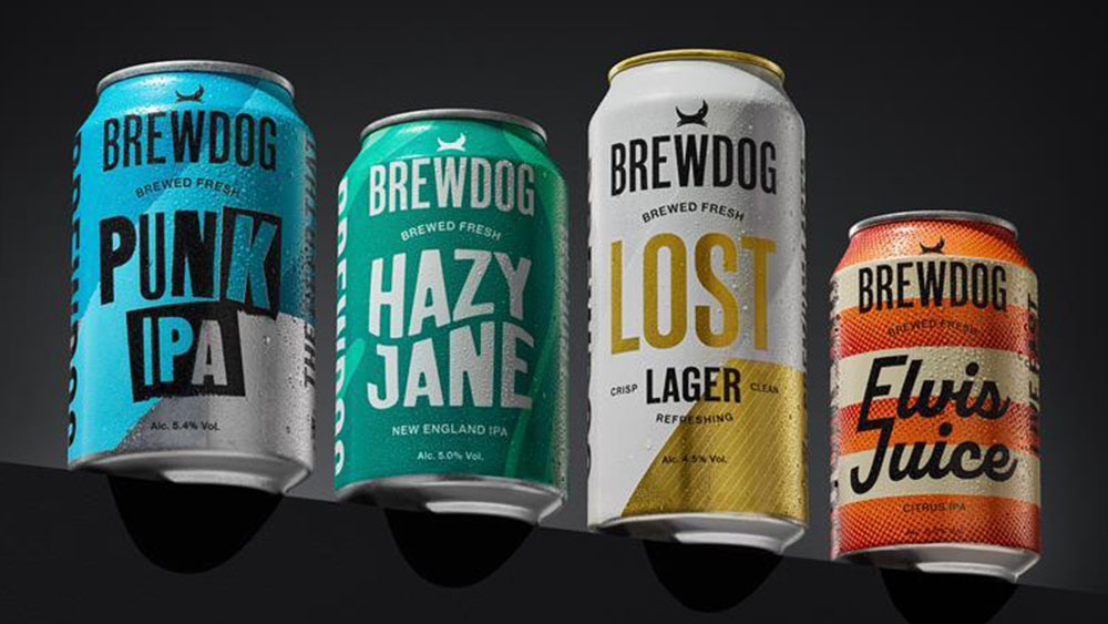
BrewDog is gradually rolling out refreshed packaging for their core lineup, including *Punk IPA*, *Hazy Jane*, *Lost Lager*, and *Elvis Juice*. The goal? To provide each beer with its own **distinct identity**—all while holding on to the familiar color palette that loyal customers know and love. While the iconic BrewDog logo remains unchanged, each beer receives its own unique font and graphic treatment. For instance, *Punk IPA* is sporting a look that *actually feels punk*—perhaps reminiscent of an old Sex Pistols album cover.
### Embracing Chaos Over Consistency
In the world of branding, **consistency** is often praised as golden. Many branding experts advocate for strict guidelines, suggesting that a brand manual should govern every visual element. Yet, for BrewDog—the **anarchic craft brewer** known for shaking things up by calling out sexism and poking political fun with cheeky taglines like “Lie-PA” ([Creative Bloq](https://www.creativebloq.com/news/boris-lie-pa))—adhering to these norms is not just impractical, it’s downright counterproductive.
One could argue that **branding experts** are overlooking the heart of what makes BrewDog successful: its ability to disrupt and challenge conventions. The new tagline “Brews fresh” underlines its commitment to not just staying relevant but also to reclaiming its tenacity.
### A Look Ahead: What’s Next for BrewDog?
As noted by Lauren Carrol, BrewDog’s Chief Operating Officer, “This is the start of a new era for BrewDog. The new packaging will do something we have always sought to do right from the start—**disrupt the category**.”
With each flicker of creativity and rebellious design, BrewDog reinforces its identity as a brand that refuses to conform. It’s an audacious revival that raises the question: What will BrewDog achieve next?
For further insights into branding revolutions, dive into *Coca-Cola’s bold new Vitaminwater logo* ([Creative Bloq](https://www.creativebloq.com/design/packaging-design/coca-colas-bold-new-vitaminwater-logo-hides-a-subtle-design-secret)) or explore the downturn of *McDonald’s CosMc’s* and whether it marks a branding fail ([Creative Bloq](https://www.creativebloq.com/design/branding/is-the-closure-of-mcdonalds-cosmcs-restaurants-really-a-branding-fail)).


