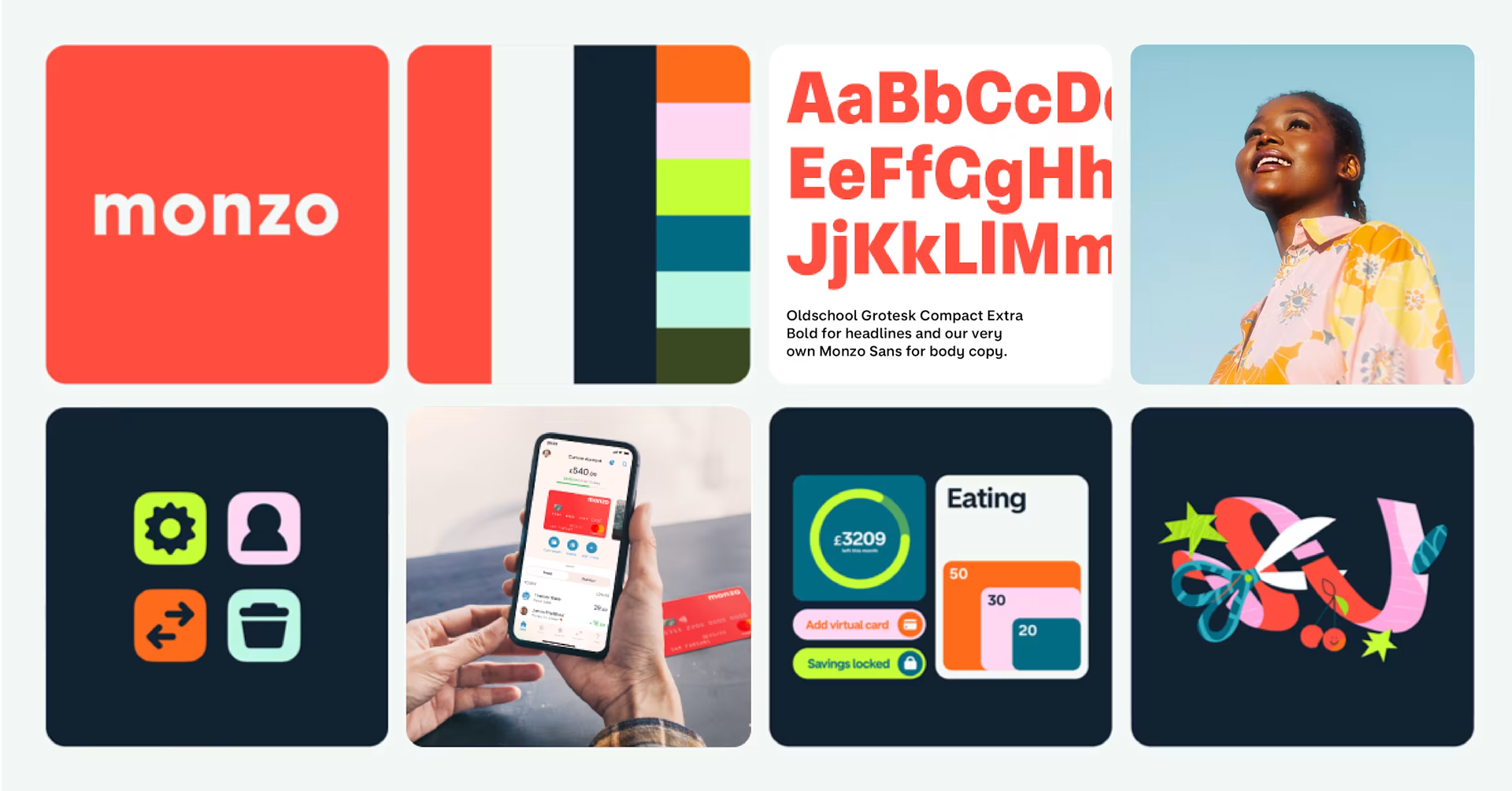
Monzo has been my go-to banking app for nearly a decade, and it has consistently raised the bar for user experience in the financial sector. When I first joined, its sleek, uncluttered user interface felt like a breath of fresh air. The **vibrant orange cards** not only looked great but made me feel as though I was part of an exclusive community. Fast forward ten years, and while Monzo’s orange cards have become ubiquitous, traditional banks still seem to lag behind in innovation. Despite a growing number of competitors, Monzo continues to lead the charge with its standout branding and user-friendly design.
The Power of Branding in Banking
When conversing with a friend who hadn’t used the app in a while, I realized that my fondness for Monzo is largely due to its **superb branding** and **exceptional user experience**. Here’s a closer look at what makes Monzo’s UX/UI so engaging.
1. Transparent Spending Overview

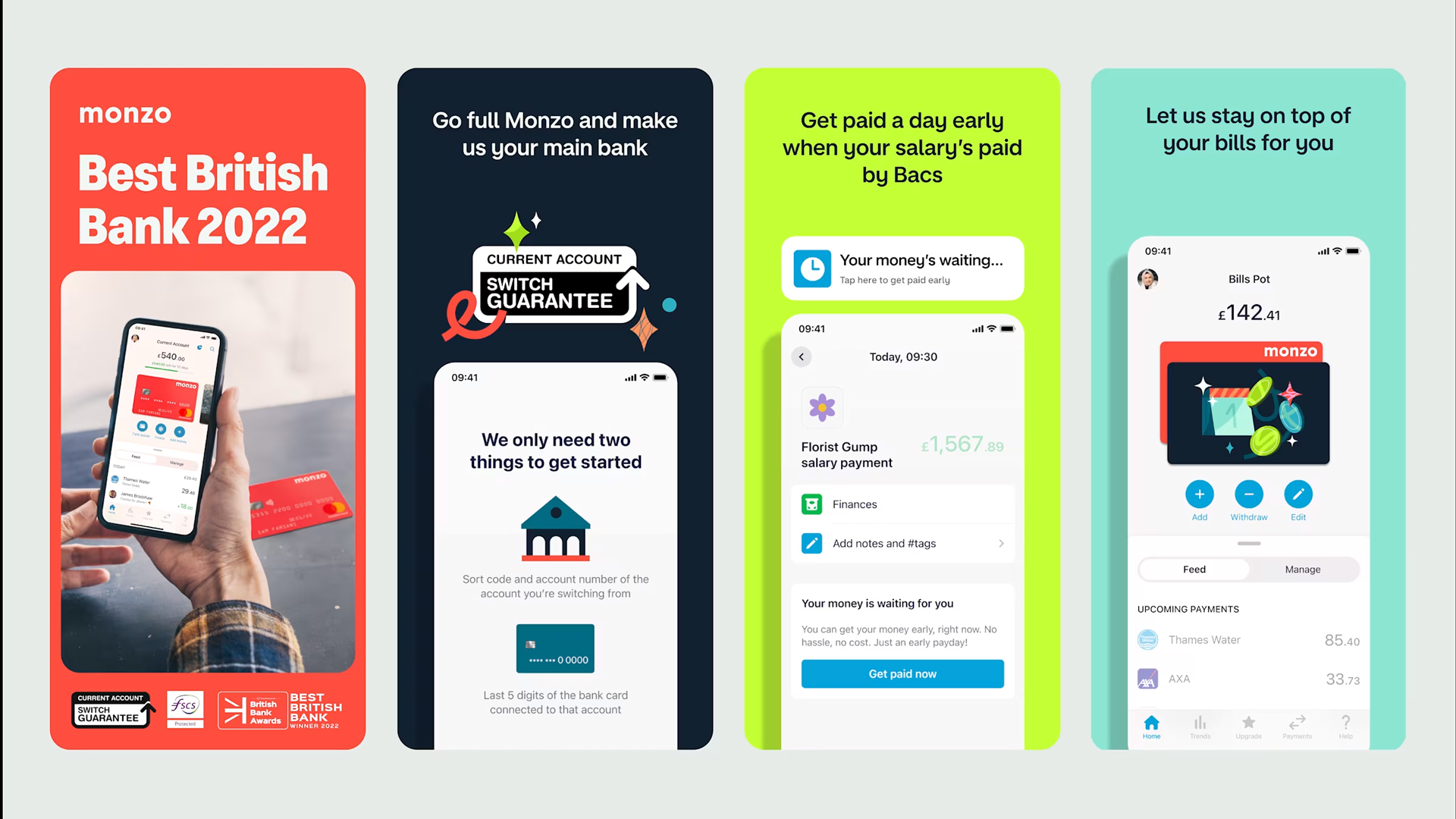
A common frustration with many banking apps is the **lack of clarity** in tracking spending. My experience with the Nationwide app comes to mind, where I only see my balance rather than a detailed account of my expenditures. Monzo, however, displays my balance at the top of the screen, allowing me to see both how much I’ve spent and what’s left in my account — all in a single glance. This **transparent approach** significantly simplifies budgeting and provides insight into daily spending habits.
2. Effortless Money Transfers

Transferring money traditionally involves cumbersome steps and endless identity checks. Monzo revolutionizes this process with just a few taps. Users can send money using only a phone number or a simple link, minimizing the hassle of adding new payees. The reassuring green tick confirms the legitimacy of new payees, enhancing user trust and ensuring funds are sent **safely**.
3. Insightful Spending Trends

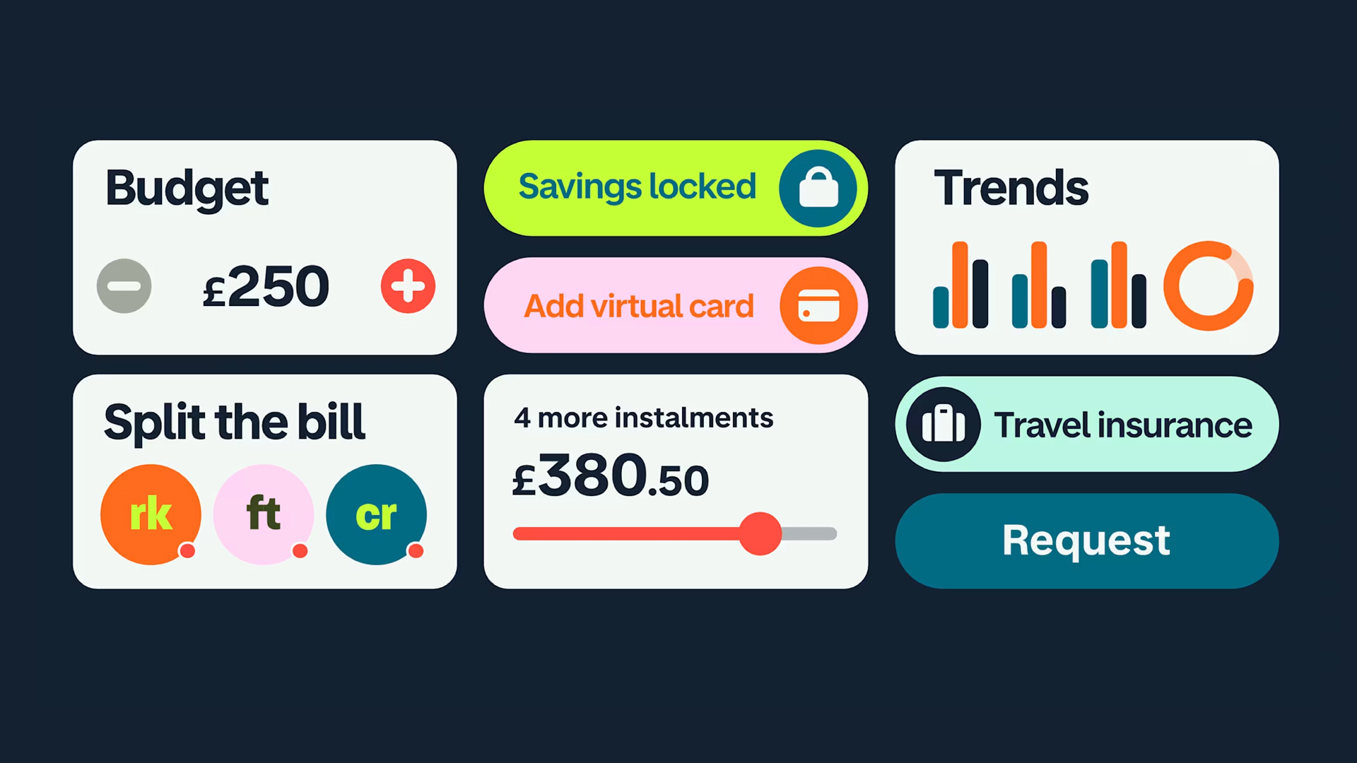
The ability to track spending trends is a game-changer for budgeting. Although I preferred Monzo’s previous interface, the new one still delivers valuable insight into various spending categories like transport, shopping, and dining out. This functionality helps users monitor their habits, although the need to scrutinize every detail of their dining expenses may be subjective!
4. Simplifying Bill Splitting
Even if I don’t use it often, the **bill-splitting feature** in Monzo adds a fun twist to handling shared expenses. With delightful animations and clear layouts, splitting bills and managing ongoing household expenses becomes a seamless experience. Each participant’s contribution is laid out clearly, ensuring that everyone knows who owes what—exactly the kind of transparency needed in a banking app.
Conclusion: A Banking App That Stands Out
Overall, my experience with Monzo has been overwhelmingly positive; I find its user experience far superior to other banking apps I’ve explored. Whether it’s clarity in spending, ease of transfers, or innovative features, Monzo truly excels.
What about you?
What’s your favorite banking app in terms of user experience and design? Share your thoughts in the comments below!


